Importance of colours in Design
When it comes to design, finding the perfect colour combination can be your winning secret to having an eye-catching creation. You could say, it’s one of the most important steps in creating a polished look.
The truth is, colour makes a design come alive. It can attract attention, set a mood, and even influence our emotions and perceptions. Different colour combinations evoke different moods or tones by using colour theory and colour psychology. Below are some of the most popular types of colour combinations used.
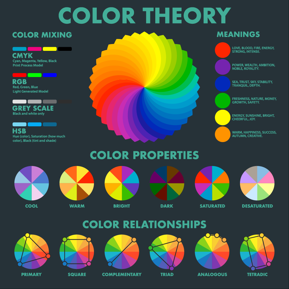
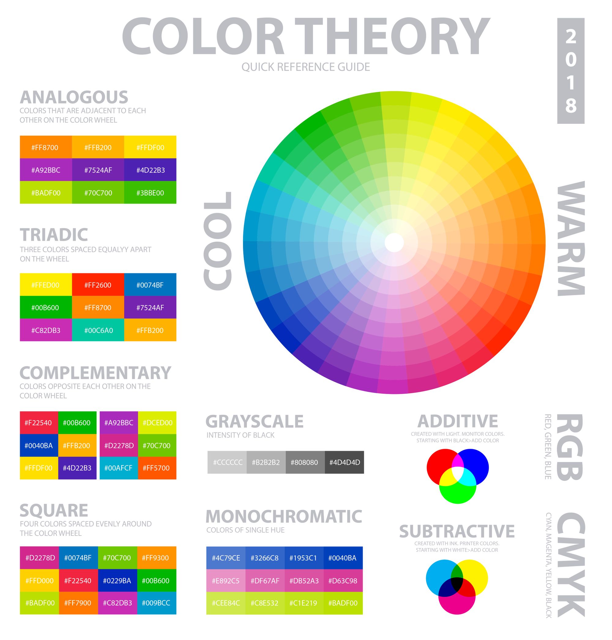
Basic Colour Terminology
- Hue: what colour something is, like blue or red
- Chroma: how pure a colour is; the lack of white, black or gray added to it
- Saturation: the strength or weakness of a colour
- Value: how light or dark a colour is
- Tone: created by adding gray to a pure hue
- Shade: created by adding black to a pure hue
- Tint: created by adding white to a hue
Few handy tips before you start your design
- Checkout design inspirations from Pinterest
- Try to choose your colour palette with Analogous combination
- Maintain Colour contrast by choosing complementary colours
It's a good idea to enter HEX code of your colours while choosing backgrounds and font colours in PixelFlow App. That will give you accurate colour combination for your intro video. Also try to use the analogous colour of your own brand colour.
Next: Organising content
Find out how to organise your content with sensible tags and authors, or for more advanced configurations, how to create custom content structures using dynamic routing.